Here is a couple from the photoshoot for my magazine cover and double page spread-


 - I used top lighting to create and underjaw shadow and high key lighting.
I also shot some more which may be included in my contents page-


I am using Abode Photoshop CS3 to edit my photos, for example, i may reduce the Brightness and Contrast or add a Photofilter to adjust the colours slightly.
Here are a few examples of the photos i have edited already-
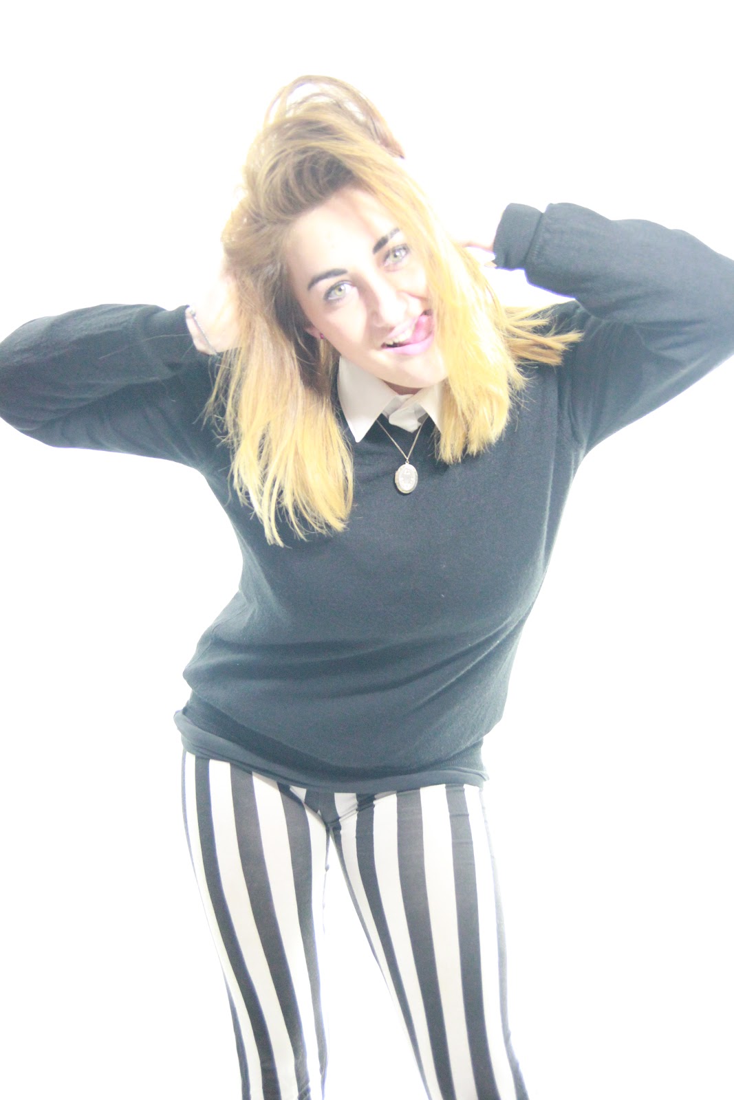
 - In this photo I have changed the Gamma and Exposure to make the photo have less glare to it and make the background go to a slightly more grey colour than plain white. Also, the clothes i have chosen for the model to wear were to create a quirky character. the smart yet casual shirt and jumper create a sophisticated personality yet the stripey leggings make the character look 'fun'. Also, the vintage necklace makes the whole outfit seem 'Indie' and 'Oldfashioned', giving a more quirky twist to my 'NME' based magazine. This is good as my target audience are being exposed to more indie stereotypes in this day and age so this may cause them to be further attracted to buy the magazine.
No comments:
Post a Comment