Evaluation
From the Preliminary Task to my main Music Magazine Cover, I have progressed with how much I know about Abode Photoshop CS3, I am now able to crop,rotate, skew and change the scale of an image. I can also:
- edit an image by using Contrast, Brightness, Photo Filters and Gamma etc.
- add multiple layers
- create shapes like arrows, circles and boxes
- edit text by creating a drop shadow or filling it in with a pattern
- place an image
- drag layers over different layers i.e. putting an image behind a masthead
- use different ranges of fonts
- zoom in on and distort several layers or images
- To take the photographs that I needed for the magazine I used a canon DSLR camera
- I searched YouTube for tutorials so I could understand how to use the camera to the best of my ability and make my photos look the best that they can for my magazine.
http://www.youtube.com/watch?v=LlXVzOZtlII
- I have also used a smaller image in my contents page of a guitar, suggesting there is a lot more to read inside my magazine, thus appealing to audiences seeking to fulfill cognitive needs (aquiring knowledge), but also perhaps those seeking tension release needs (escape and diversion).
- For my contents page, I have separated the layout into 3 columns, on the left hand side, i have introduced the interview which is seen in full on the double page spread. Underneath this I have included some information about a band which is one of the '24 new bands', which includes language that can be seen as simplistic and not too overly challenging due to my teenaged target audience. For example, phrases like 'Don't miss them on MTV Rocks' and 'gigs and broken guitars'. Also, I have used the same 'BEAT' Masthead that is seen on the front cover, therefore following the house style throughout.
- I have then added a second column which includes 'News', 'Reviews' and 'Plus' and separated them into 3 sections so it is easier for my target audience to navigate what they want to read etc.
- The far right column in the 'BAND INDEX' which is also seen in NME magazine and this features the 24 bands which are mentioned on the front cover above the masthead.
- I have also added an advert which is located at the bottom of the contents page, this advertises a package that includes recieving the magazine monthly along with merchandise and stickers etc. This is seen also in NME magazine.
- For my double page spread, I chose to produce an interview for my music magazine and used the typical layout, with a large image on the left hand page and the right hand page dominated by text (but i have added 3 smaller images on the bottom of the right hand page to make the page look less empty but at the same time the readers will enjoy more images of the artist). This layout seems to be comfortanle for the way that British readers seem to scan from left to right as they read. The text is arranged in three columns, which is also a common convention of music magazines. I chose to used a similar layout to conventional magazine because i wanted readers to feel that the design pf the page was familiar.
- The left hand page is dominated by an image of the recording artist that is being interviewed (as seen in most NME magazines for the double page spread). Regular readers will be used to such images and probably demand similar; fans of the artist will enoy a larger image and may even come to collect them. I have used high key lighting for my images as i believe it creates more character and readers will be more attracted to a brighter image.
- The article/interview is on the right hand side and includes Questions and Answers, this is because my focus group said they didn't mind a mix between a full interview and continuous text. Also, the double page spread has 'BEAT' in the top right hand corner to remind the readers what magazine they are reading.
- I have included a pull out quotation to offer some insight into the interview to follow. This is intended to pull in the kind of reader who is simply skipping through the magazine and who may be interested in buying it (this offers entertainment and an enticement for readers interested in the artist)
- Additionally, I have added a few arrows throughout to ease the readers into navigating their way through the magazines.
Here is my finished products including my Pleminary Task, Music Magazine Front Cover, Contents Page and Double Page Spread:


http://en.wikipedia.org/wiki/NME
http://www.mediaknowall.com/as_alevel/alevel.php?pageID=image
My media product uses, develops and challenges forms and conventions of real media products in many ways; the first is that it is based on NME Magazine. The New Musical Express, popularly known by initialism NME, created by Theodore Smythson, is a music journalism publication in the United Kingdom, published weekly since March 1952. It started as a music newspaper, and gradually moved toward a magazine format during the 1980s, changing from newsprint in 1998. It was the first British paper to include a singles chart, in the 14 November 1952 edition. In the 1970s it became the best-selling British music newspaper. During the period 1972 to 1976, it was particularly associated with gonzo journalism (self-involved reporting), then became closely associated with punk rock through the writing of Tony Parsons. - http://en.wikipedia.org/wiki/NME
A media institution is a company or organisation that is
accountable for a media text; this could be through marketing, production,
distribution or regulation. Examples of media institutions are http://www.bbc.co.uk/, http://www.sky.com/shop/ and http://edition.cnn.com/.The distributor for
NME is IPC Media; http://www.ipcmedia.com/.
After much thought, it is pretty obvious that they would not take on ‘BEAT’ as
they already have an Oligopoly that is NME, which is hugely successful across
many Countries like the UK and America. By having my product distributed by
Bauer http://www.bauermedia.co.uk/ or
Future http://www.futureplc.com/ I
believe it would be successful as they have a lot of experience with rock music
magazines and this is seen throughout some of the most popular music magazines
of our time. I believe both of these institutions would publish my product to wipe
out any competition it may arise by being supported by another institution. An
advantage of having my magazine accounted for by a small niche company would be
that they’d have more time and focus for my product which means more control
and interest over my magazine. Examples of Bauer Magazines and Future plc
magazines are-


Furthermore, I could extend my product by setting up a radio
station or a ‘BEAT’ Tour to run alongside it. This would increase the
advertisement of my media product and in the long term can expand to reaching a
larger, more varied audience.
The dominant representation of 17-19 year olds (i.e. a
teenager) has negative connotations of drugs, alcohol, trouble, violence,
moody. However, some may say teenagers are full of life, clever and energetic.
My media production represents this particular social group as I have used a
swear word on the front cover as this connotes rebellion and represents the
group as disobedient. My magazine should aim it attract both males and females;
I have no differentiated it to a certain sex.
I believe that after much editing, my magazine runs smoothly alongside the theme of NME. Since I first started making my magazine it has changed considerably, from my mock ups:


To my main production:


Mise en scene-
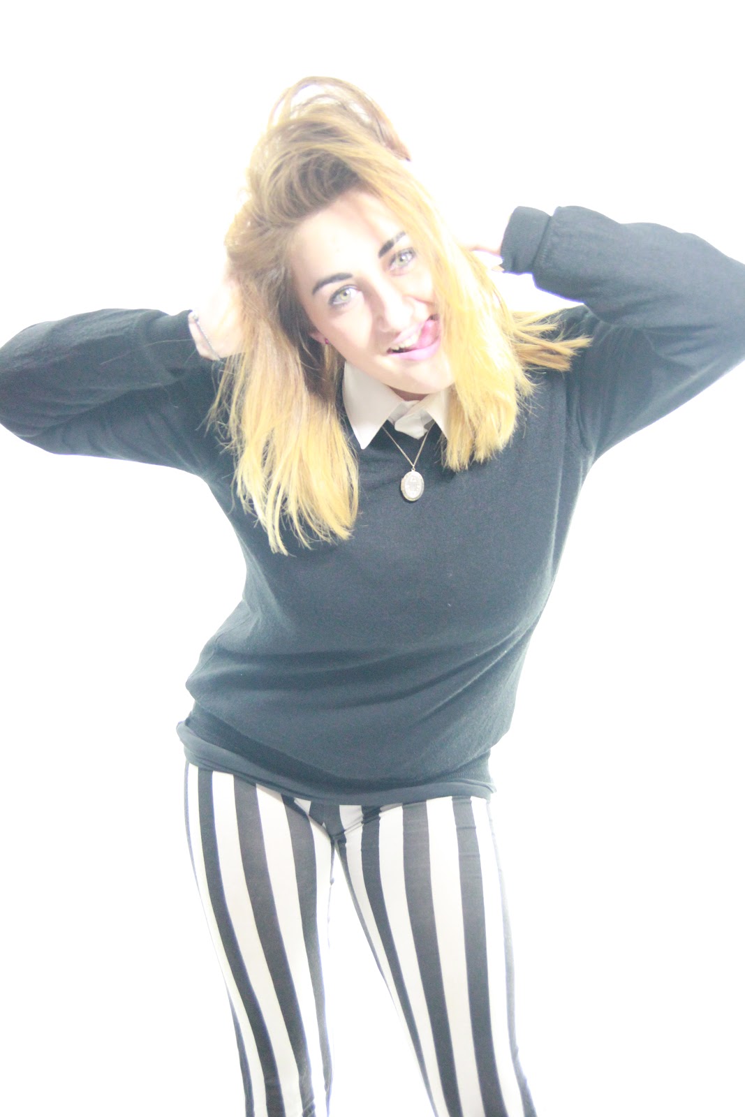
This term (which loosely means 'arranging the frame') includes the design and arrangement of the image. Every element of an image contributes to its meaning, and much time and thought is devoted to mise en scène by the creators of an image. For my main front cover, i wanted my character to look quirky yet not too loud, so she is wearing a plain jumper but with stripey leggings as this adds pattern, however, after much editing i decided that the front cover looked a lot better zoomed in so that it was a medium close up. In addition, it still looks like a quirky magazine as my character is poking her tongue out and the necklace she is wearing looks quite vintage. Therefore giving the indie magazine a quirky/interesting twist.
- The theme of NME does vary depending on what information is inside and who the main artist is on the front cover (i.e. for the Rihanna front cover, the important text is Deep Pink instead of Red) but whichever theme/colour scheme they decide to use, it is always consistent throughout the magazine and it can be clearly identified as NME.
It can be clearly seen that the layout and colours have
changed drastically. I made all of the text capital letters as seen on the
front cover of NME Magazine-This term (which loosely means 'arranging the frame') includes the design and arrangement of the image. Every element of an image contributes to its meaning, and much time and thought is devoted to mise en scène by the creators of an image. For my main front cover, i wanted my character to look quirky yet not too loud, so she is wearing a plain jumper but with stripey leggings as this adds pattern, however, after much editing i decided that the front cover looked a lot better zoomed in so that it was a medium close up. In addition, it still looks like a quirky magazine as my character is poking her tongue out and the necklace she is wearing looks quite vintage. Therefore giving the indie magazine a quirky/interesting twist.
- The theme of NME does vary depending on what information is inside and who the main artist is on the front cover (i.e. for the Rihanna front cover, the important text is Deep Pink instead of Red) but whichever theme/colour scheme they decide to use, it is always consistent throughout the magazine and it can be clearly identified as NME.


- I decided to place the masthead over the main image because this was a new magazine and therefore i would need to establish the masthead before i could mask it with the images.
- I chose 'BEAT' as the name of my magazine as I believe it is a good name for a music magazine as it is associated with the 'beat' of a drum.
- I chose a strong colour, which was then repeated in a few of my sell lines and this would therefore help me to establish a consistent house style as i continue to produce later copies of the magazine.

- My central image uses a single artist/band looking directly into the camera which creates a direct mode of address, this helps to suggest a connection between the artist being represented and the audience/reader.
- Media instiutions use stereotypes in their products because the audience will instantly understnad them. A visual shortcut is a stereotype that is repeated so often that we assume they are normal or 'true'. I believe my magazine represents the female as fun/quirky/friendly but is not represented in a sexual appealing way as most magazines appear to do this a lot. This would therefore be called a countertype which is a representation that challenges traditional stereotypical associations of groups, people or places.
My audience for my media product will be youth i.e. 16-19 year olds, both male and female and i have priced it at £3.29 as i believe this is a reasonable price. In my focus group meetings, the majority of the students were willing to pay anything up to £4.00 so i priced it at £3.29 as this would be considered psychological pricing and customers would be more willing to buy it at this particular price.
I addressed/attracted my audience by creating a focus group-
- I gave a questionnaire to the majority of the students in my common room as my magazines' target audience is youth to young adults (16-19 years old) and this therefore matches the demographics of my target audience.
- I recieved back 16 questionnaires out of 30.
- I continued to refer back to them and show them my work in progress so they could give me feedback etc.
- The
information that came back from the questionnaires was very positive, helped
me include the correct content for my target audience and design my finished product.
Overall, I am very pleased with the way my magazine has turned out, I have learned a lot of technical skills throughout working on my work e.g. from Photoshop CS3 to creating my own blog. I have really enjoyed creating my front cover, contents page and double page spread and am overly happy with the outcome.
- I recieved back 16 questionnaires out of 30.


